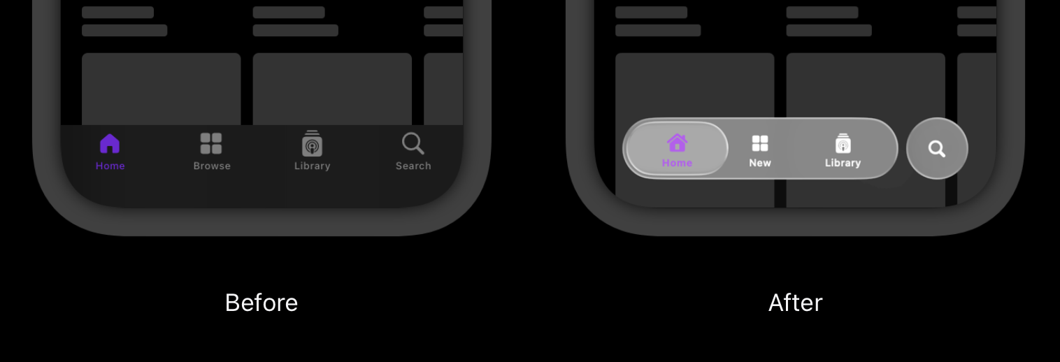
There has certainly been a lot of feedback on Apple’s debut of Liquid Glass at last week’s WWDC25.

As with most change, some folks love it; others, of course, hate it. The initial reactions have included everything from sheer speculation to some spirited memes (e.g., whether Liquid Glass was just a shiny object meant to distract us from some of the company’s AI shortcomings).
The one-word description I’d use to summarize the feedback is polarizing.
While I do applaud the evolution of a general design language and its underlying design systems, unification for the sake of unification generally isn’t a great idea.
Context, user goals, and what each of the platforms are inherently good at matters much more.
I do share some of the initial usability concerns of Liquid Glass being adopted across all of Apple’s family of devices and their respective OSes, I’m not going to get into the pros and cons of it all until I’ve actually used it.
However, what I found most interesting 🤔 about the announcement was where the original design inspiration came from. Liquid Glass was explicitly inspired by the Apple Vision Pro’s visionOS design for spatial computing.
But here’s the thing: Liquid Glass works really well on visionOS because it’s fundamentally designed for the demands of interacting with spatial computing.
It leverages things like depth, light, motion, and perceptual cues in ways that feel native to immersive environments. It wasn’t intended for flat screen experiences.
And why does it work so well in visionOS?
There are several reasons. Let’s take a look at a few:
Spatial Hierarchy & Floating Layers
Floating elements in visionOS aren’t just decorative — they are key to how users perceive depth and hierarchy. By occupying z-space, UI components gain a natural sense of order. Users intuitively understand what’s in focus, what’s secondary, and what’s interactive based on depth. This spatial organization is a cognitive aid, not just a stylistic choice.
Optical Fluidity
The layered, refractive nature of the UI allows it to subtly recede into the background when it’s “at rest” and then assert itself when needed. This balancing act creates an interface that becomes expressive and responsive when engaged. It almost contributes to a sense of calm presence due to the lack of persistent, visual clutter.
Transparency & Light Interaction
In spatial environments, transparency isn’t ornamental, it’s functional. It enables visual blending, depth perception, and interaction with ambient lighting. Shadows, refraction, and even parallax effects help UI elements feel embedded within the user’s environment, rather than simply bolted on top. The end result is something that feels both context-aware and physically realistic.
Perceived Tactility
visionOS conveys tactility through the careful interplay of motion, lighting, and responsiveness. Components appear to have weight and texture. Animations are subtle but reactive, creating the illusion of resistance (or what some might call a kind of pseudo-haptic feedback). This visual tactility aids usability — and also builds trust!
Adaptive Motion & Specular Highlights
Animations in visionOS respond fluidly to a user’s gaze, gestures, and lighting conditions. Specular highlights — which is the subtle gleam that moves across a surface based on light and it’s angle — reinforce the position, orientation, and even the material of an object. These cues help ground the UI in 3D spaces, allowing users to perceive proximity and overall hierarchy at pretty much a glance.
All of this adds up to a cohesive design that feels intuitive and appropriate because it’s constantly adapting to the user’s environment by it’s very nature.
Overall, through the use of light, motion, depth, and responsiveness, the system builds an interface that feels not just seen, but can almost be sensed. That’s not just superficial stuff; it ultimately contributes to the product’s natural ease of use.
On Other OSes, too?
So... now what if you take that design philosophy and apply it to their other platforms? Hmm.
Will it translate well given the various input/output considerations?
Instead of the intent of clearly separating content from things like navigation and other elements, will it be perceived as just an unecessary layer of “chrome”?
Could it usher in a new era of design affordances and signifiers (i.e., borrowed from spatial computing) that actually work on flat screens?
Or, is the whole thing just unnecessary and overly gratuitous?
At the moment, it’s frankly hard to say.
There is even some speculation that this is a design gateway for their future AR glasses; a product line Tim Cook is reportedly quite bullish about. For example, getting users “prepped” for digital overlay content in their everyday worlds.
Familiarity and similarity of design cues across a bunch of different products is one thing. Potentially retrofitting decades of design best practices across desktop, web, and mobile simply to showcase a new technology feels a bit risky.
Ultimately, I do have faith that with design revisions based on real user feedback, as well as platform-specific iteration, there will be good design choices made.
For the moment however, I can’t help but think that using an AR/VR-first design language might present some early bumps in the road on the way to something that is as smooth as, well, glass.
Marc